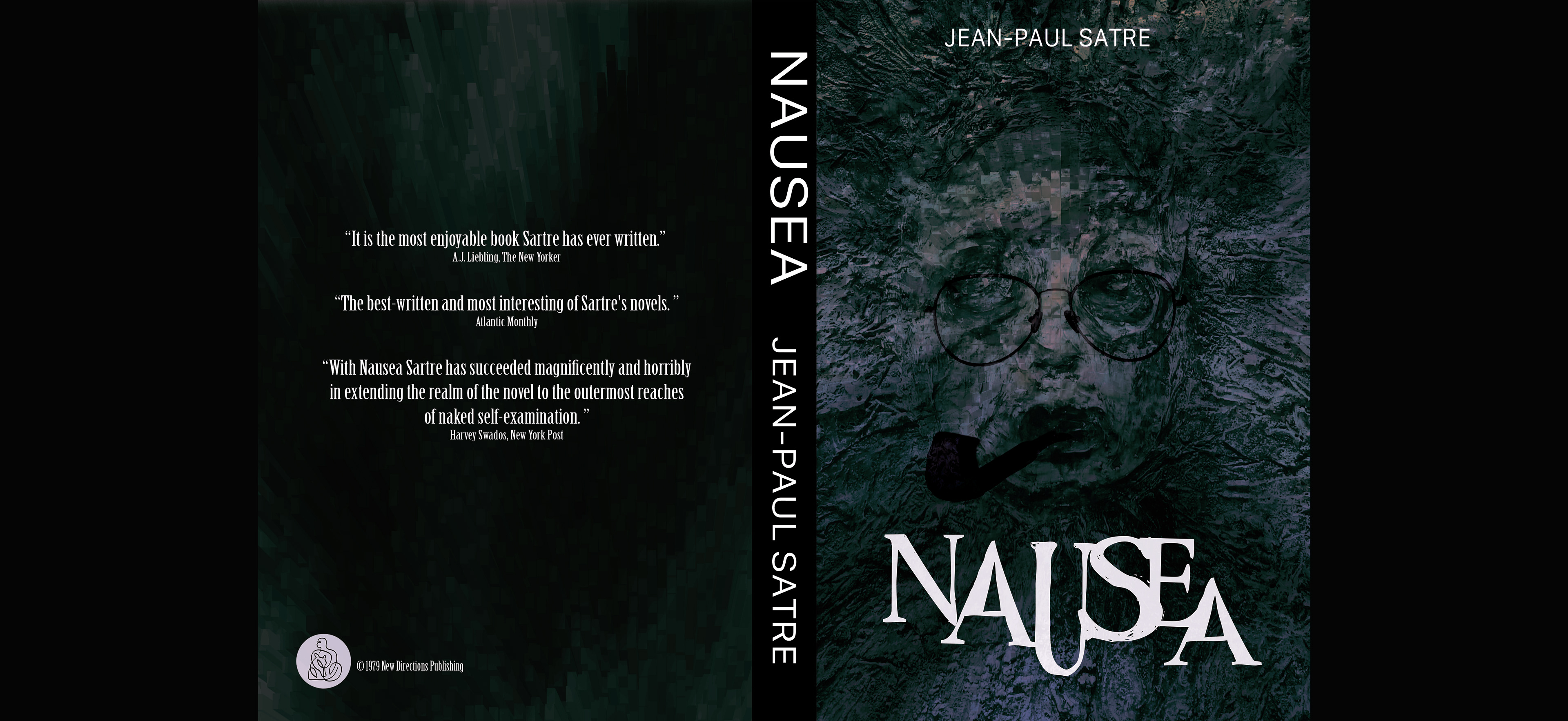
Nausea Book Cover
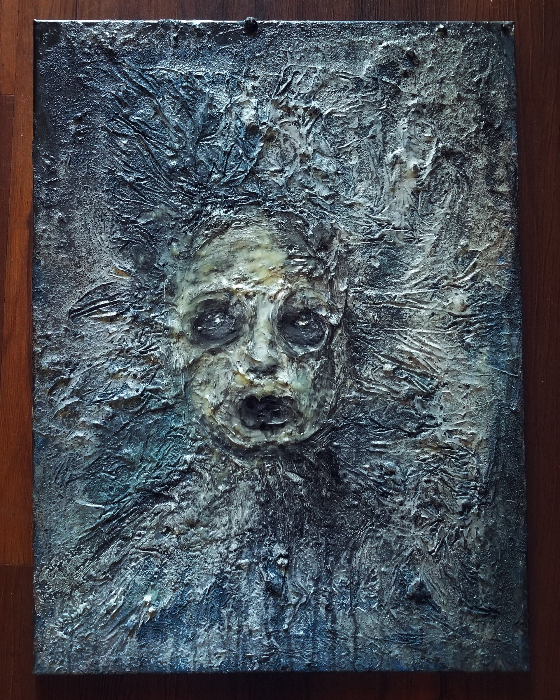
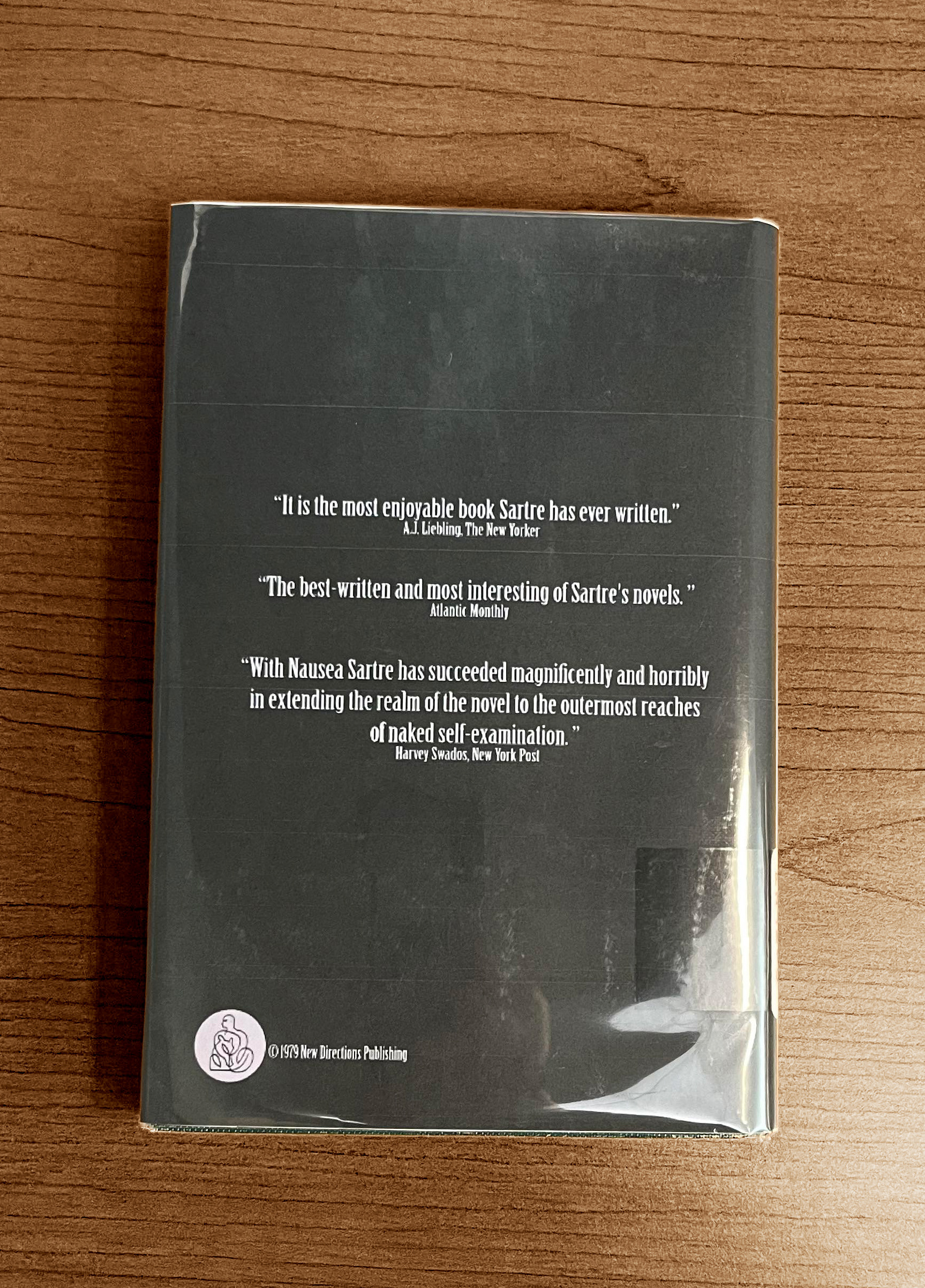
"Nausea" is a book about existentialism written in the 1930s by Jean-Paul Sartre. Salvador Dali -- one of my art heroes -- painted the original book cover. It was an honor and privilege to do the same. I started with a painting I completed during a serious episode of anxiety, feelings that were not dissimilar to that of the book's main character. After some work in Adobe Photoshop and text treatments in Illustrator, my design -- along with some others -- was submitted to the Cape Fear Community College library as a new cover for its copy of "Nausea." My work was selected and printed. I also submitted a large-scale print of this design to The CFCC 2024 Student Art Show and it won first place in the Graphic Design Category.



Pattern of Childhood
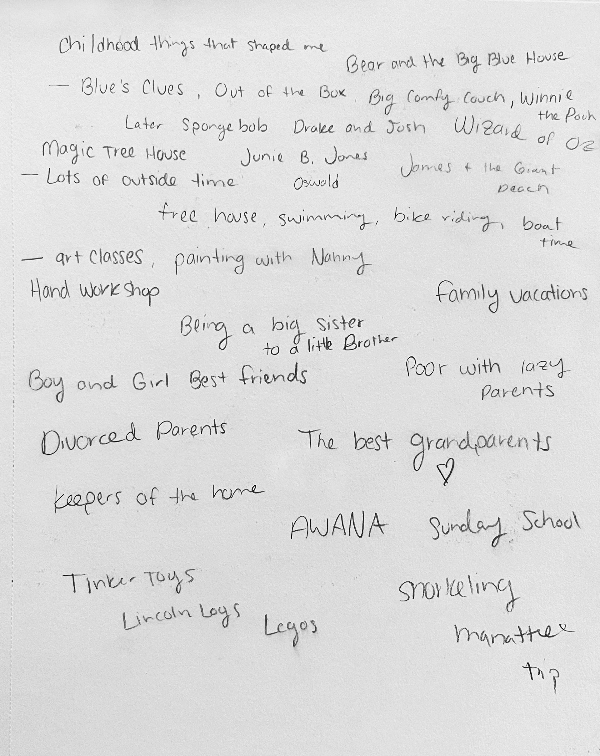
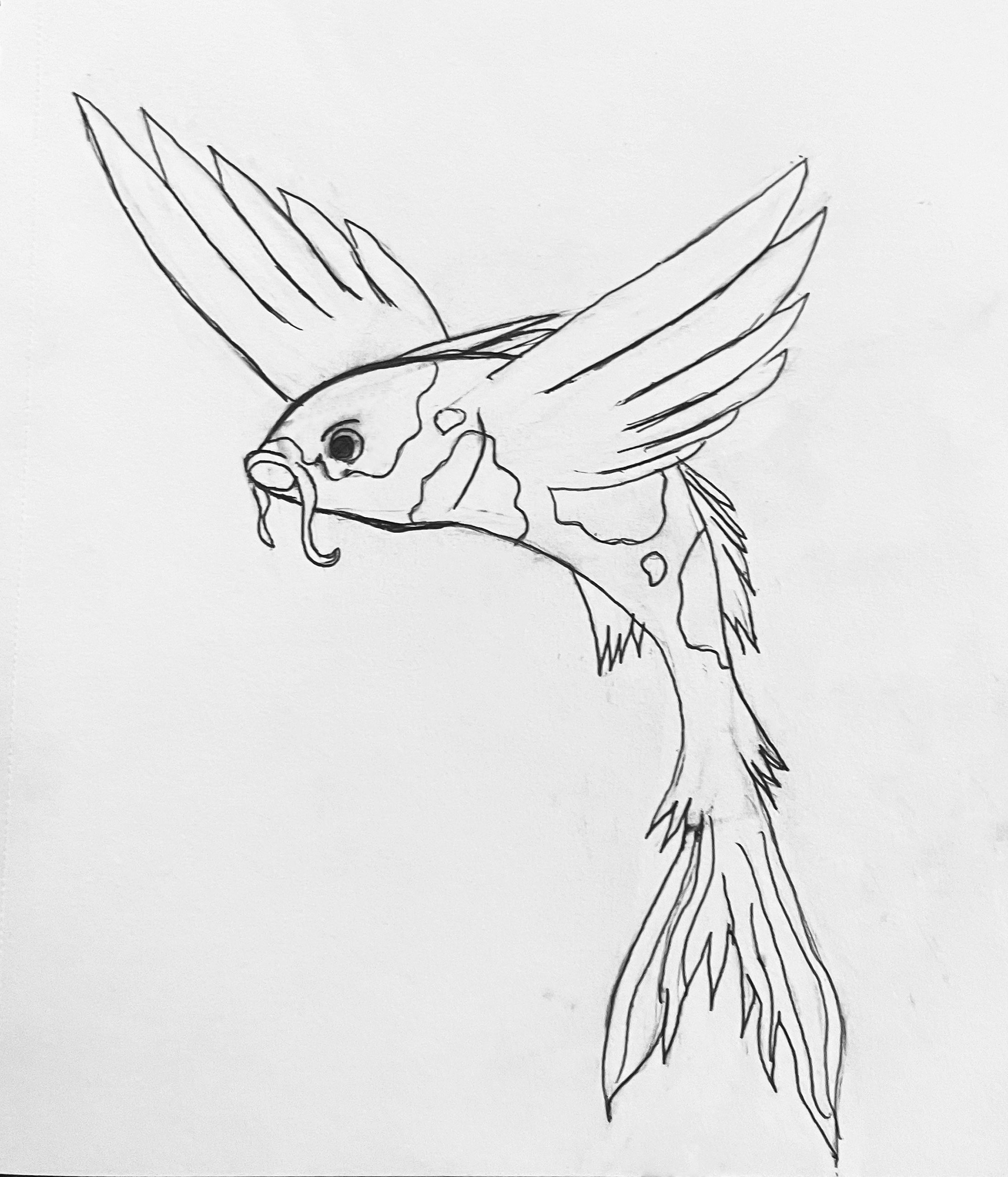
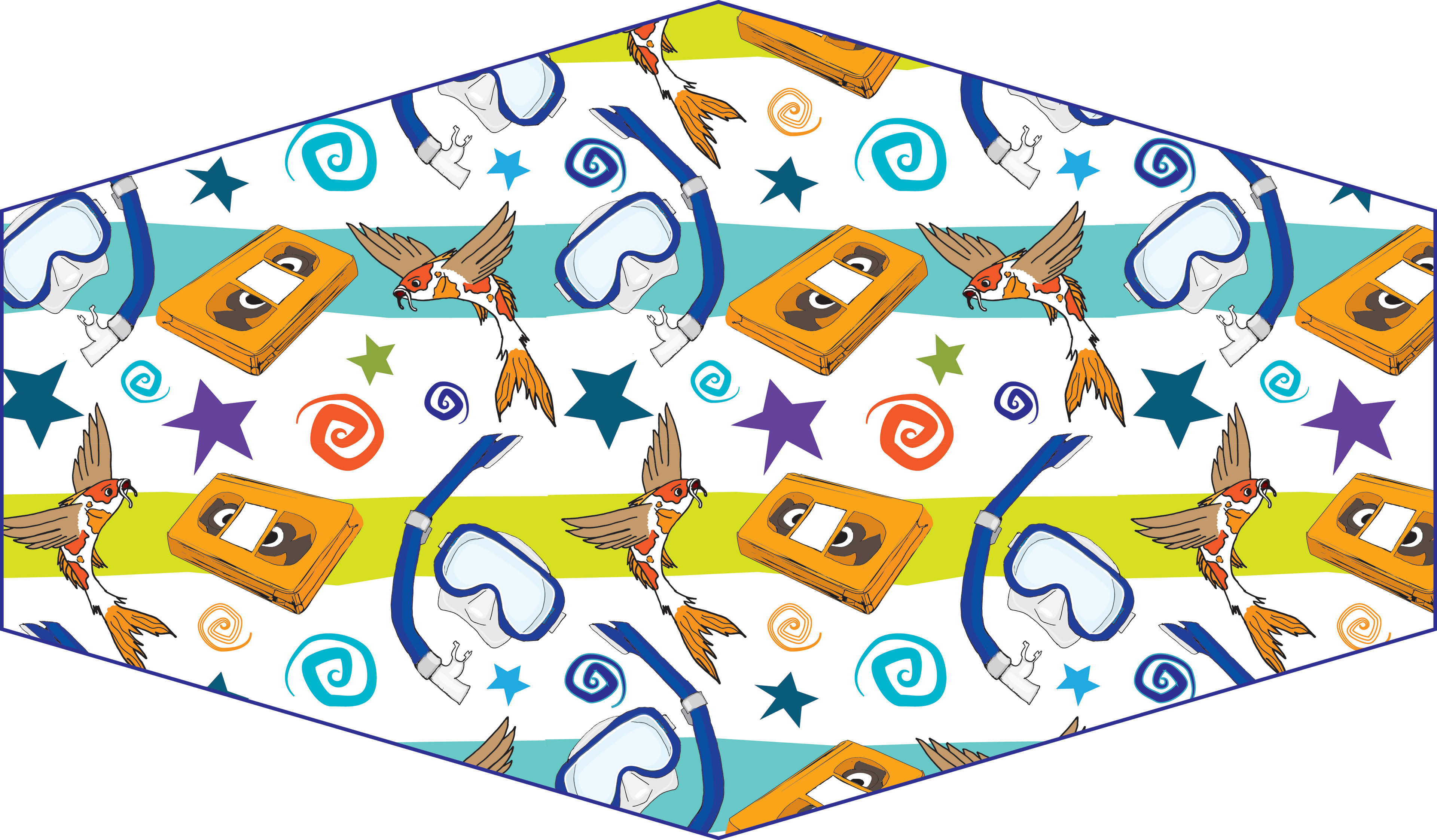
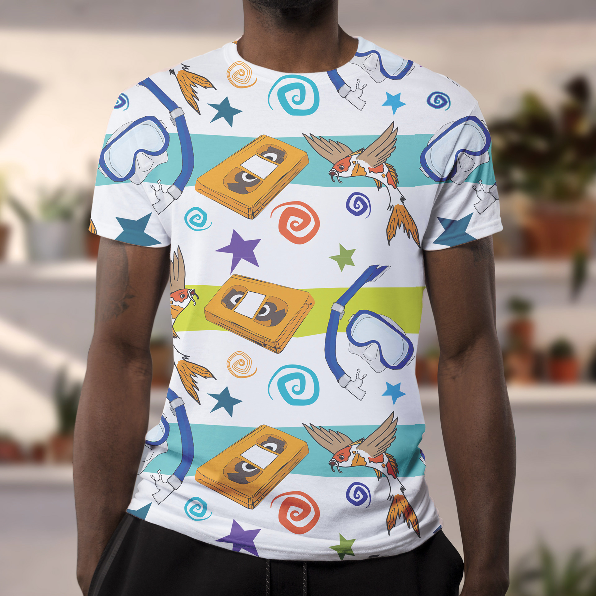
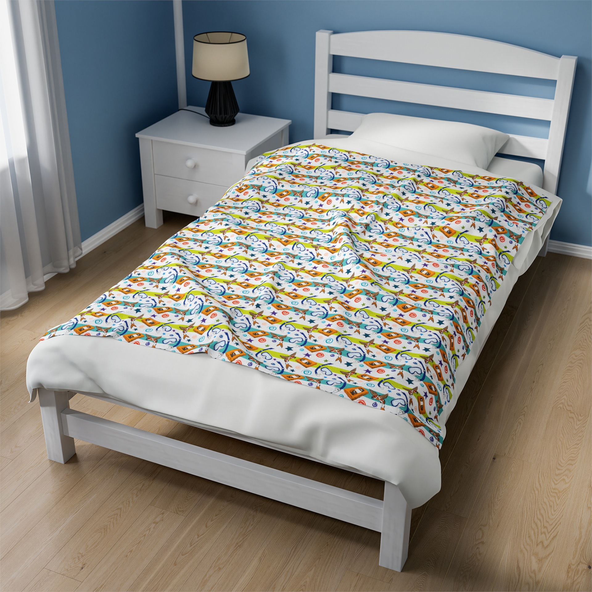
How does one synthesize their formative years into a singular pattern? For me, it began with a note-taking process where thoughts of my past flowed from my pencil into a jumble of words. From there, specific life-altering memories were selected and drawn as symbols: a flying koi fish, the unofficial mascot of my high school; an orange VHS tape, which represents a bygone era of technology; and a snorkel mask. The first time I went snorkeling, when I was in middle school, altered my brain chemistry. All of these symbols were organized into a pattern reminiscent of 1990s bed sheets.
How does one synthesize their formative years into a singular pattern? For me, it began with a note-taking process where thoughts of my past flowed from my pencil into a jumble of words. From there, specific life-altering memories were selected and drawn as symbols: a flying koi fish, the unofficial mascot of my high school; an orange VHS tape, which represents a bygone era of technology; and a snorkel mask. The first time I went snorkeling, when I was in middle school, altered my brain chemistry. All of these symbols were organized into a pattern reminiscent of 1990s bed sheets.


1984 Book Cover
This book cover began as a mood board that conveys the dystopian themes of the novel "1984." The idea of Big Brother being depicted as a watchful eye lurking around the protagonist was the fundamental concept that informed this design. There is one figure with distinguishable features and color that is illuminated. The other figures are featureless -- identical faceless copies, plagued by sameness. The eye of Big Brother is shrouded in darkness. The eye was painted in oil and manipulated in Photoshop. The other elements were generated using AI tools and altered to fit the composition.
This book cover began as a mood board that conveys the dystopian themes of the novel "1984." The idea of Big Brother being depicted as a watchful eye lurking around the protagonist was the fundamental concept that informed this design. There is one figure with distinguishable features and color that is illuminated. The other figures are featureless -- identical faceless copies, plagued by sameness. The eye of Big Brother is shrouded in darkness. The eye was painted in oil and manipulated in Photoshop. The other elements were generated using AI tools and altered to fit the composition.



Seasonal Coloring Page
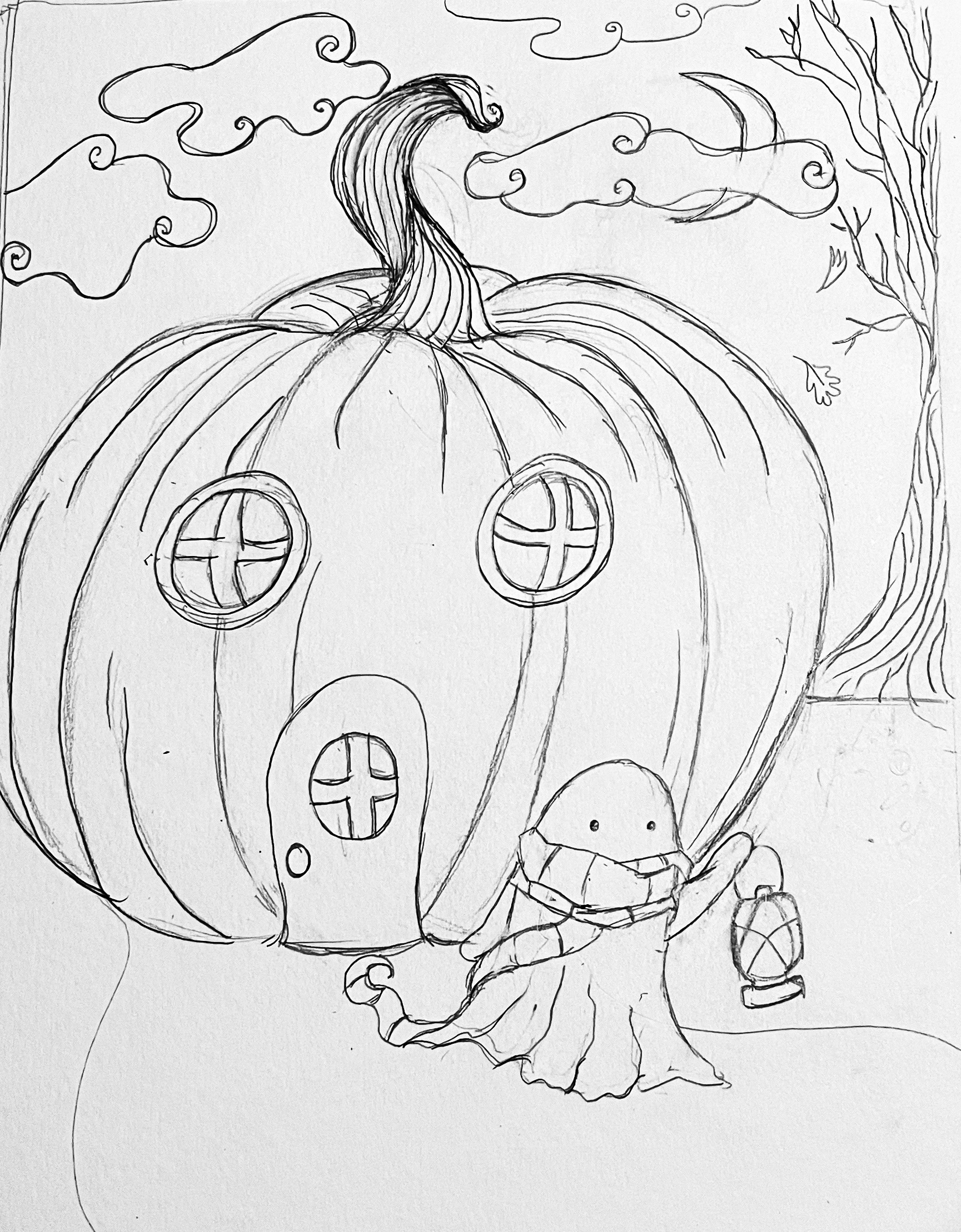
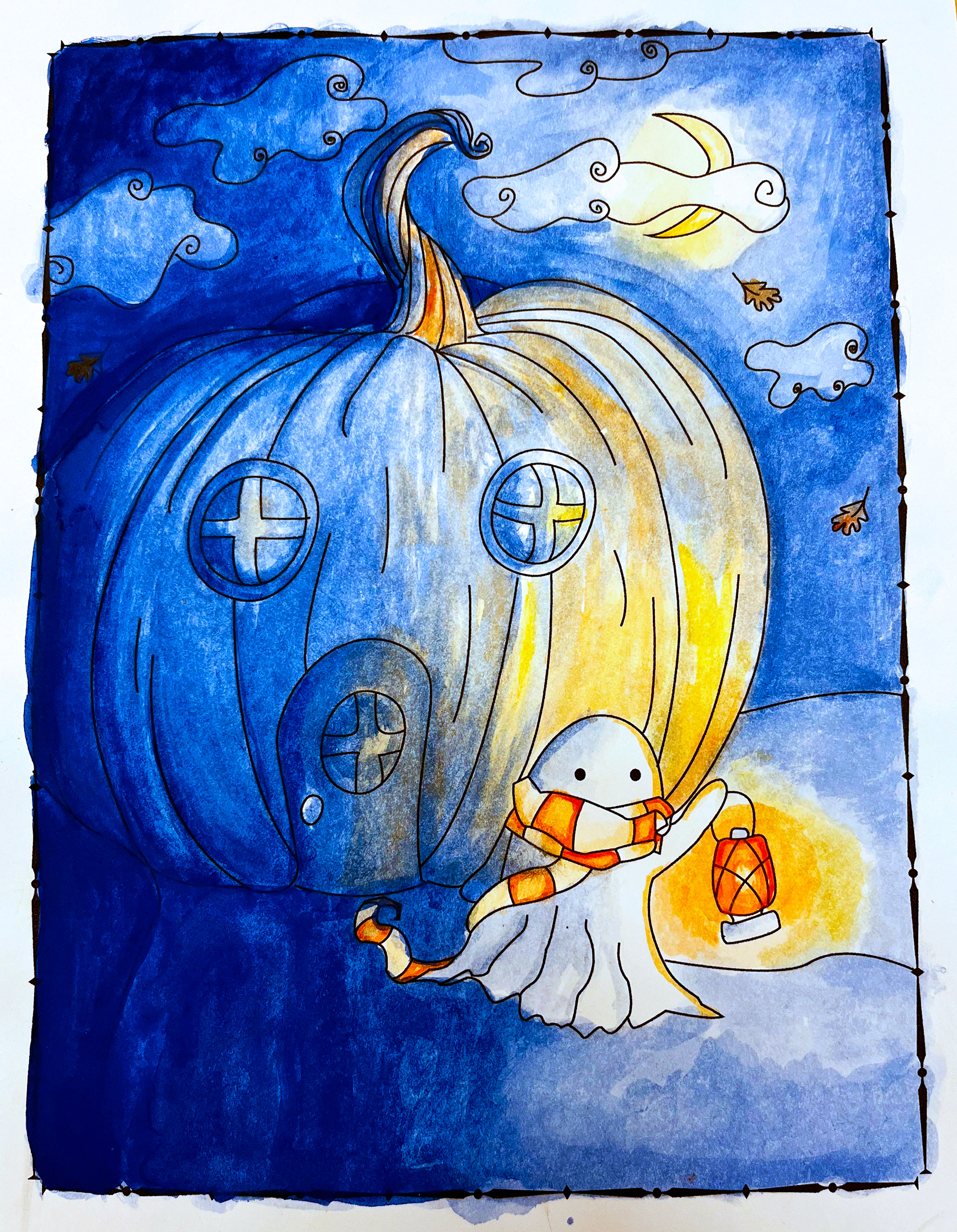
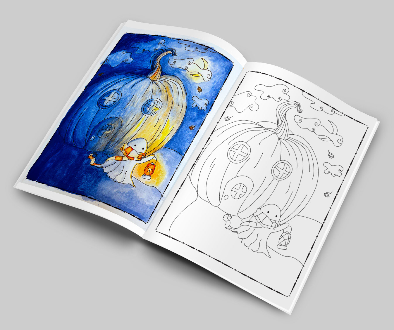
For this project, a coloring book page was sketched in graphite and then traced using the pen tool in Adobe Illustrator. The design features many simple shapes with plenty of space for coloring, but with enough detail to keep it interesting. When coloring the design, a complementary color scheme and water media were chosen as an homage to the coloring books of my youth. (The books with the little watercolor palettes attached to the front and the terrible plastic bristle brush.)
For this project, a coloring book page was sketched in graphite and then traced using the pen tool in Adobe Illustrator. The design features many simple shapes with plenty of space for coloring, but with enough detail to keep it interesting. When coloring the design, a complementary color scheme and water media were chosen as an homage to the coloring books of my youth. (The books with the little watercolor palettes attached to the front and the terrible plastic bristle brush.)

OarFish SurfBoard
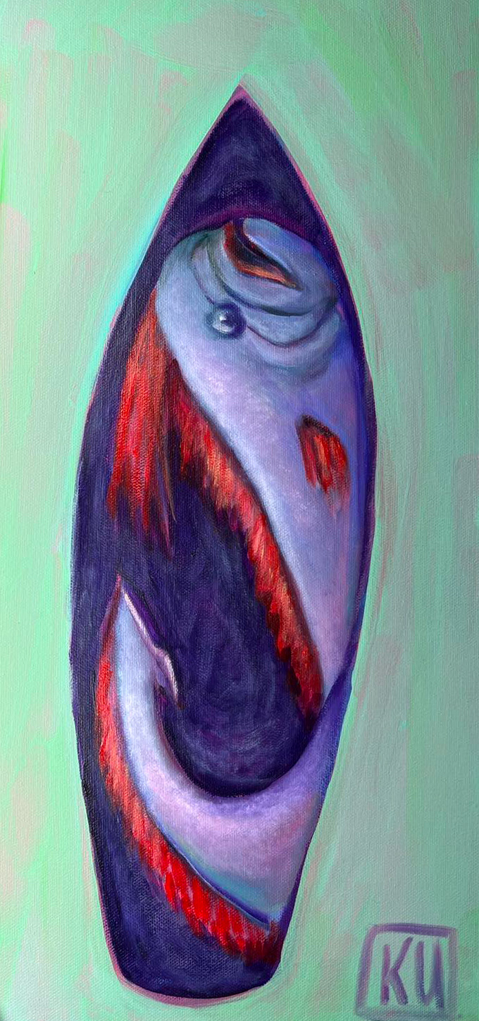
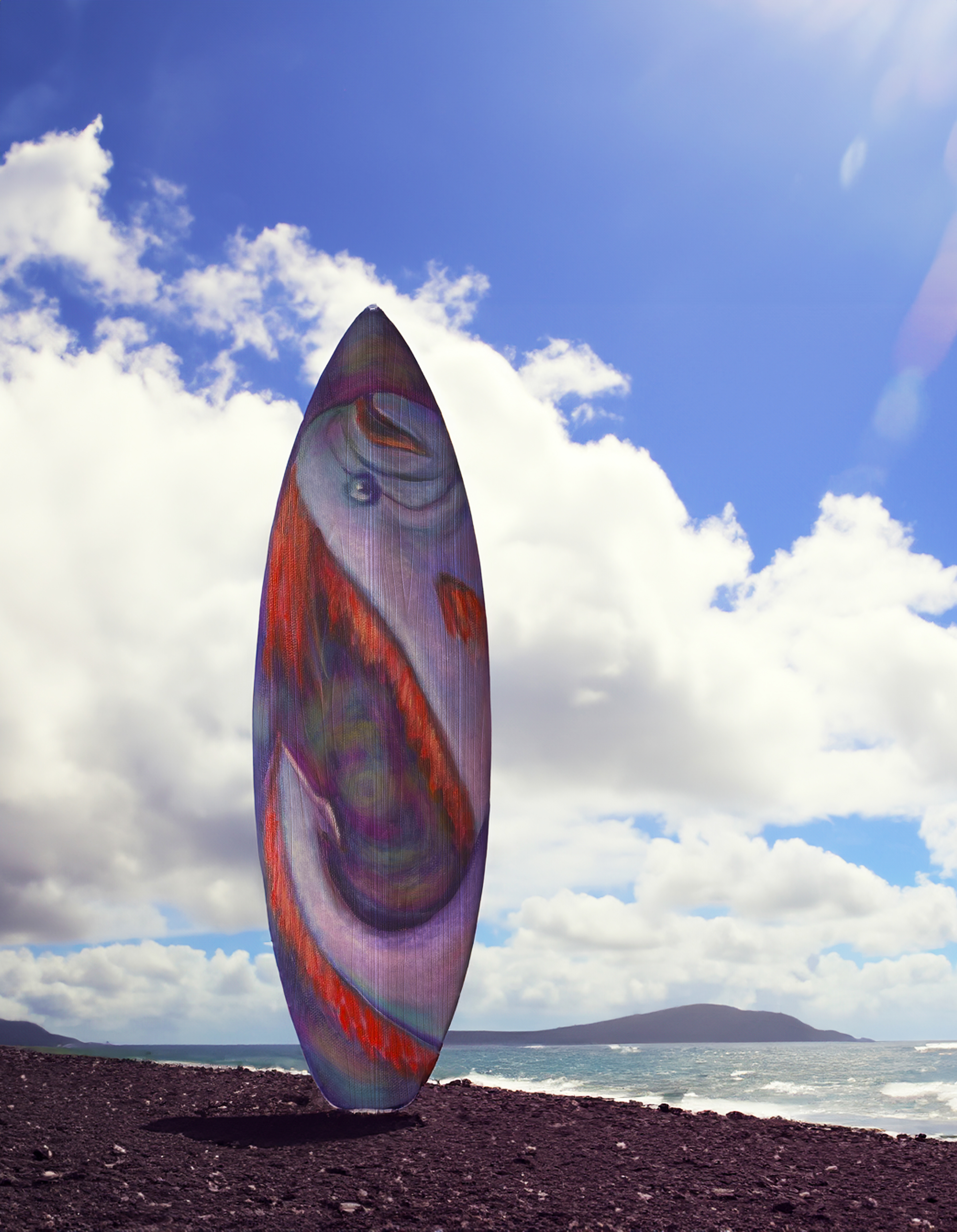
In considering the design for this project, I desired to shed light on an underrepresented creature. The oarfish was chosen due to its inherent mysticism and unique appearance. Using the initial sketches as a reference, I modified the design and painted it using acrylic paint on canvas. The final product was converted digitally using the Adobe Suite.
In considering the design for this project, I desired to shed light on an underrepresented creature. The oarfish was chosen due to its inherent mysticism and unique appearance. Using the initial sketches as a reference, I modified the design and painted it using acrylic paint on canvas. The final product was converted digitally using the Adobe Suite.


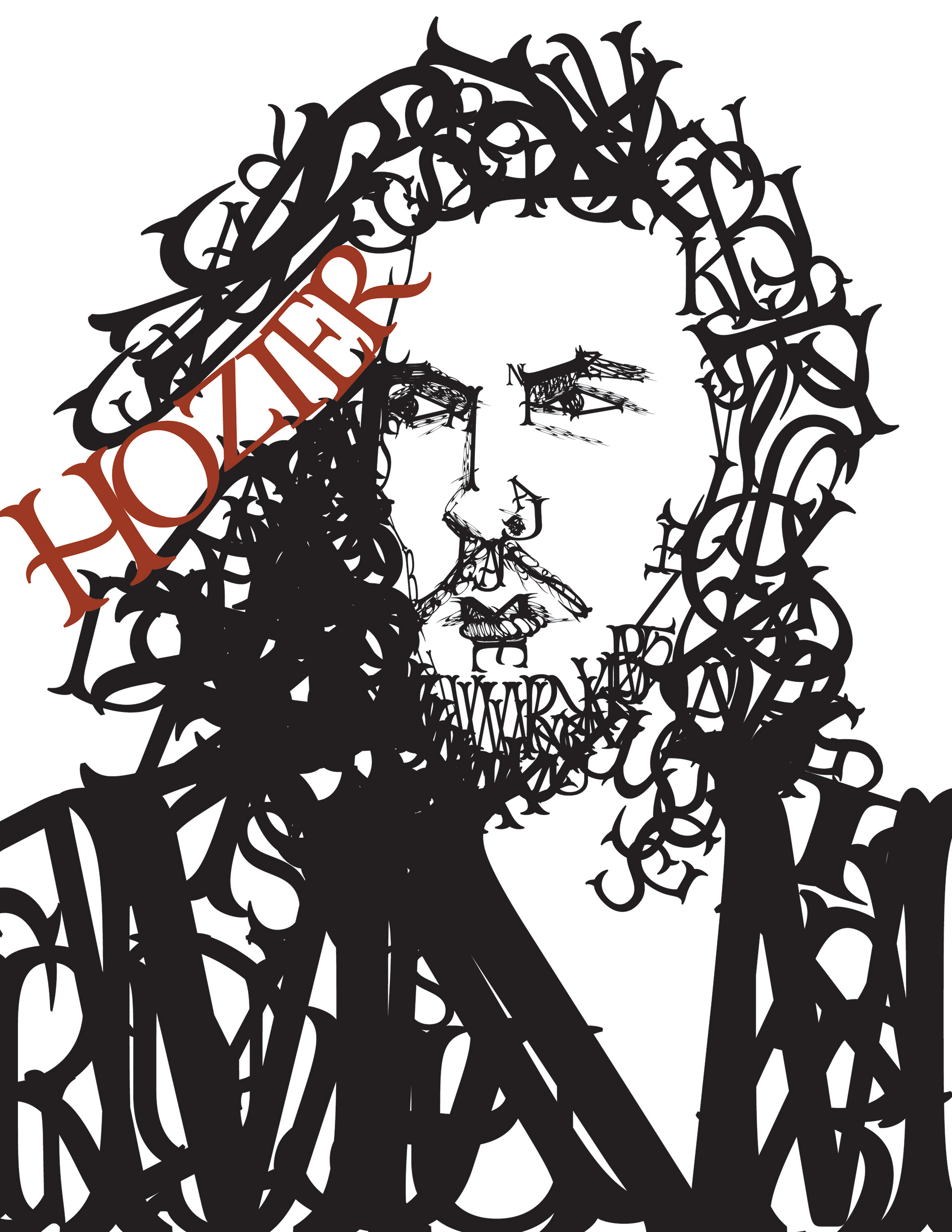
Hozier Letter Portrait T-Shirt Design
This project aimed to create a visible representation of a famous individual for use in print media. I chose the musician Hozier. His work is poetry in song form. He has such a vintage romantic vibe that I chose to use the Mr. Darcy Adobe font and used a cross-hatching-like approach to create dimension. This design is available for sale as T-shirts, prints, and stickers in my Etsy shop.
